
Stacked Products to
Strategic Funnel
How we redesigned MaxPro Fitness's Shopify store to match their brand, eliminate customer doubt, and guide every visitor from landing to purchase.
A recognised fitness brand with a website that wasn't keeping up.
MaxPro Fitness is a well-established name in the Indian fitness equipment market, selling treadmills, dumbbells, and home gym setups across the country. Their site was already pulling strong traffic — the problem wasn't visibility. It was what happened after visitors arrived.
Good traffic. No structure to convert it.
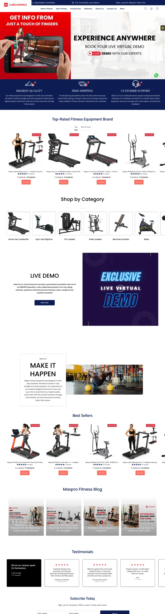
The old homepage was essentially a product dump — banners followed by an unorganised list of products, with no clear path for a visitor to follow. For a brand selling high-consideration purchases like treadmills, this layout was costing them sales they had already earned.
- No customer journey — products stacked without logic or order
- Home and commercial buyers sent through the same mixed category
- Promise boxes present but poorly aligned — looked unfinished
- About Us section buried, too short, and visually weak
- Best sellers mixed in with everything else — no hierarchy
- No dedicated section to build trust before asking for a purchase
One page. One funnel. Every section earns its place.
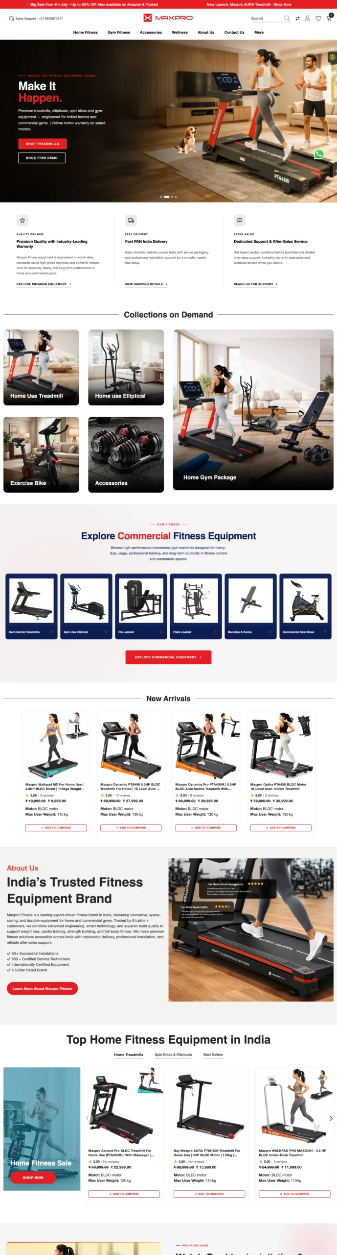
Brand-aligned hero banner
The new banner was built to MaxPro's exact brand colour guidelines — immediately signalling a premium, consistent identity that carries through the entire page.
Promise boxes that actually eliminate doubt
Three redesigned trust boxes placed directly below the hero: premium quality with industry-leading warranty, fast Pan India delivery, and dedicated after-sales support. These remove the three biggest objections before the customer even scrolls to a product.
Addressing objections early increases conversion by up to 30%Collections on demand — navigate, don't search
Instead of a wall of mixed products, visitors now see a clean collections section where they can jump directly to what they're looking for — treadmills, dumbbells, or commercial equipment — without wading through everything else.
Separated home and commercial audiences
A dedicated "Explore Commercial Fitness Equipment" section was added for business buyers — keeping them on the page instead of losing them to confusion in a single mixed category.
Live installation demo video
One of the biggest hesitations for home fitness equipment buyers is installation. Placing a real installation demo video on the homepage removes that fear before it becomes a reason not to buy.
Product videos increase purchase intent by 85%Media coverage as credibility
MaxPro has been featured across multiple publications. That recognition was buried before. We brought it onto the homepage where it belongs — as instant, third-party proof of the brand's authority.
The full transformation.
Scroll through both designs side by side to see every structural and visual decision that changed.
A homepage that works like a sales team.
Every section now has a job to do — build trust, reduce doubt, guide the right buyer to the right product, and give them every reason to purchase before they leave.
Clear Funnel
Every section moves the visitor one step closer to a purchase
Doubt Eliminated
Quality, delivery, and support promises visible before products
Separated Audiences
Home and commercial buyers each have their own clear path
Brand Authority
Media coverage and social proof visible where it matters most
Want a website that converts,
not just looks good?
Every project starts with a free 30-minute strategy call. No pitch — just an honest conversation about your goals.